NRW
Role
Brand and design direction
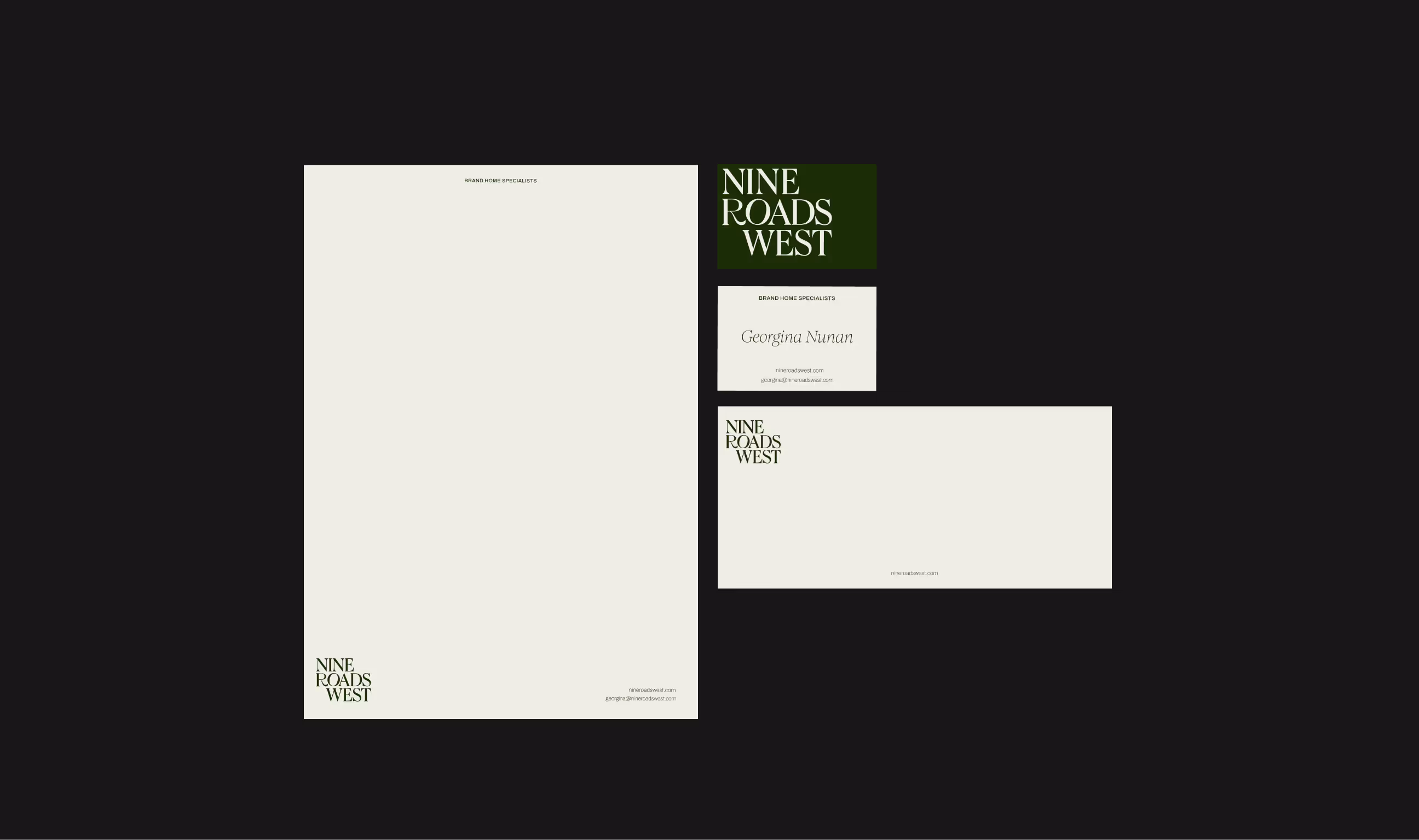
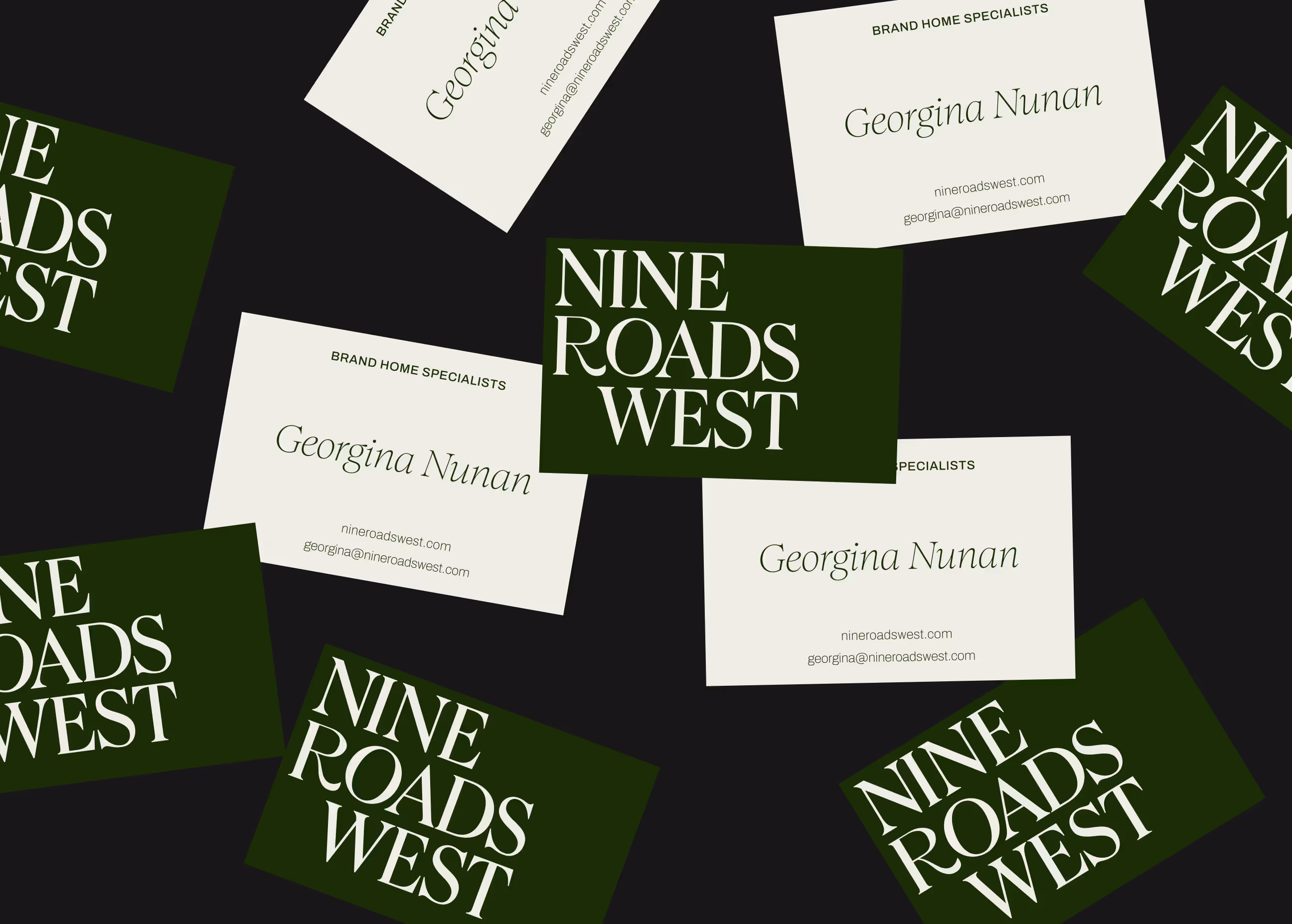
Brand identity and guidelines
Logo design
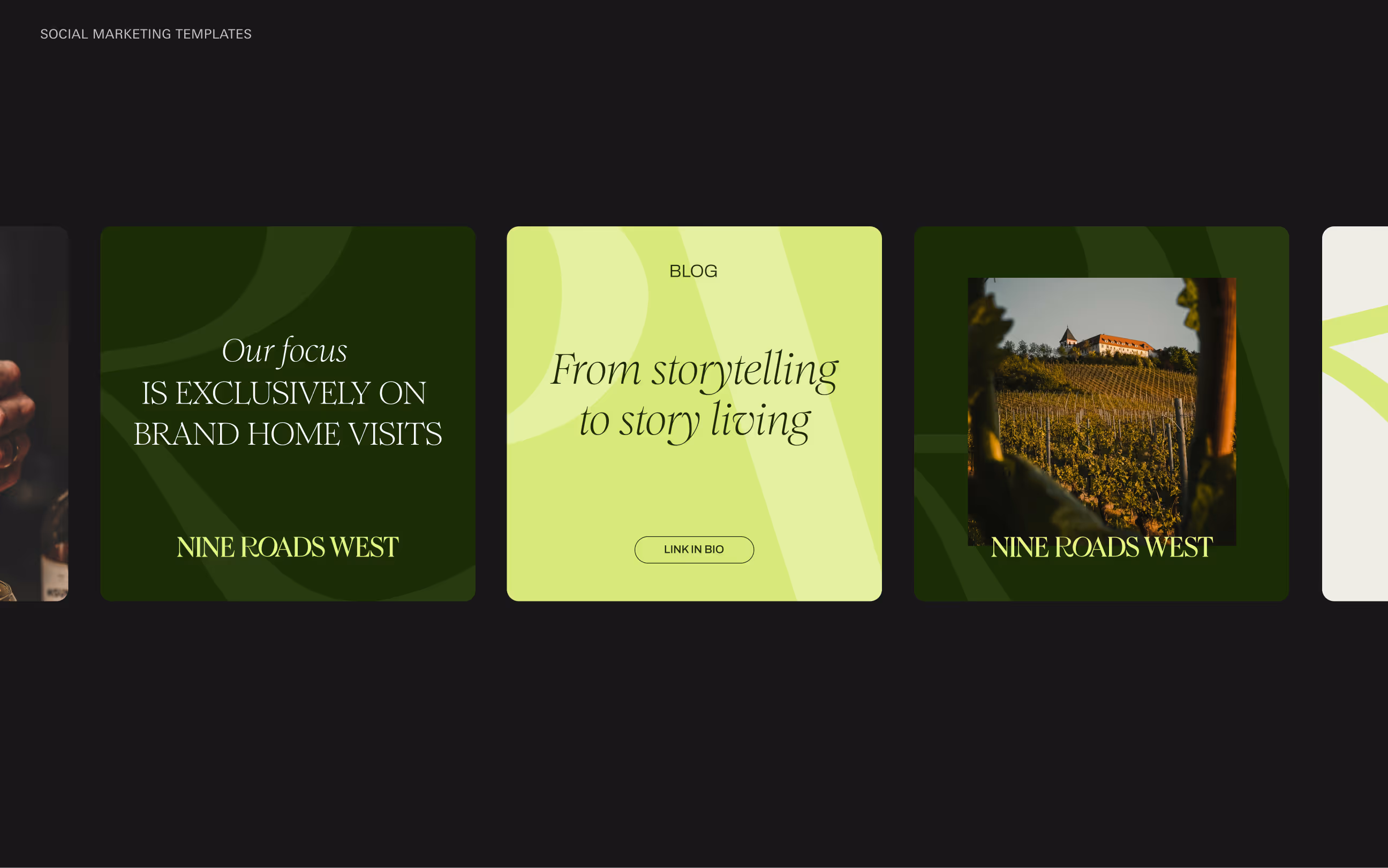
Digital marketing
When I partnered with the founder, it became clear from the market and competitor analysis that there was space for a brand that felt high-end but still warm and approachable. With that in mind, I explored concepts inspired by experiential branding, editorial design and luxury hospitality.
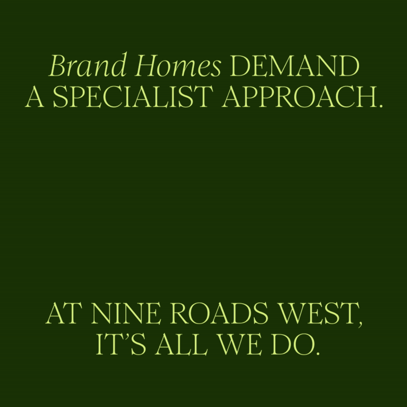
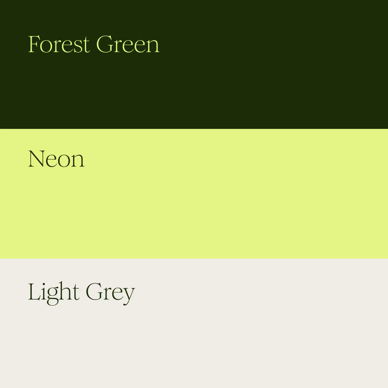
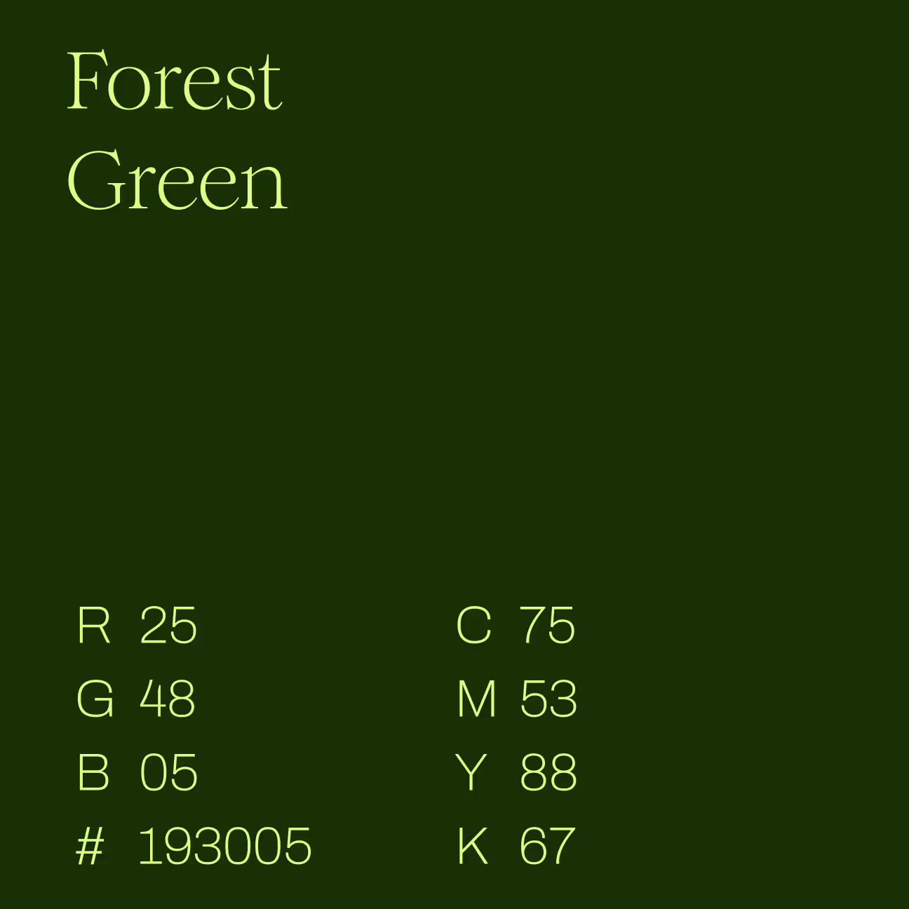
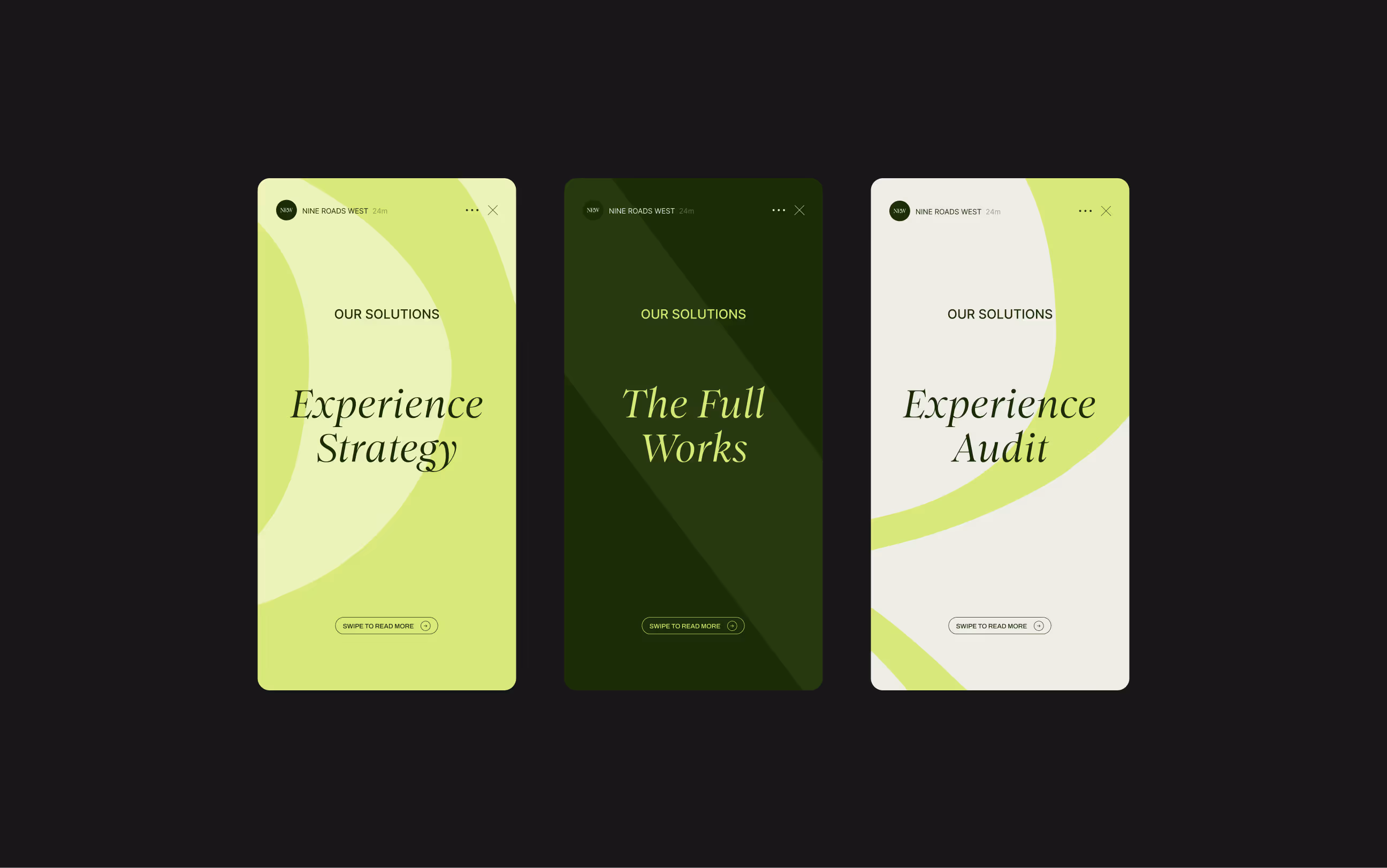
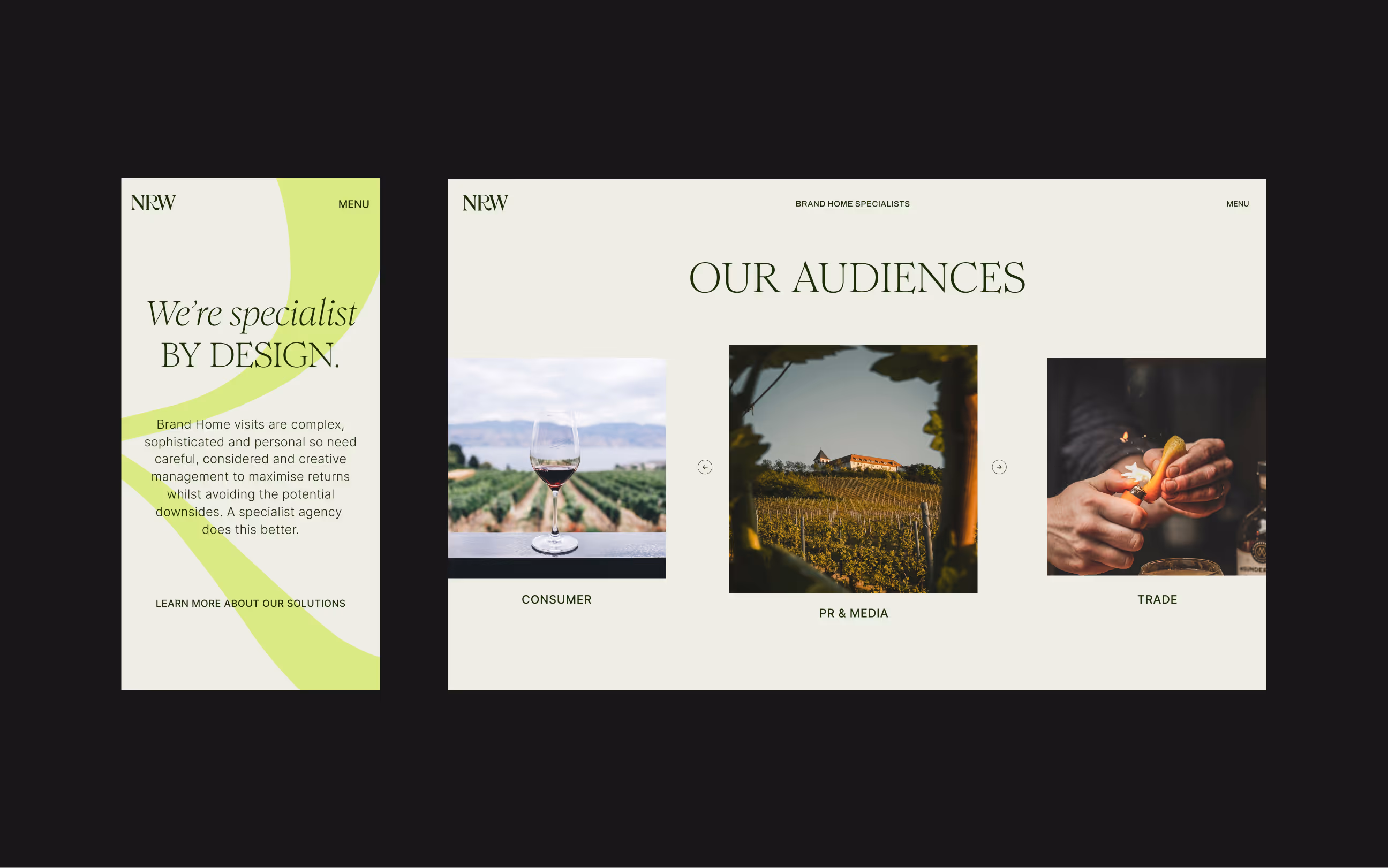
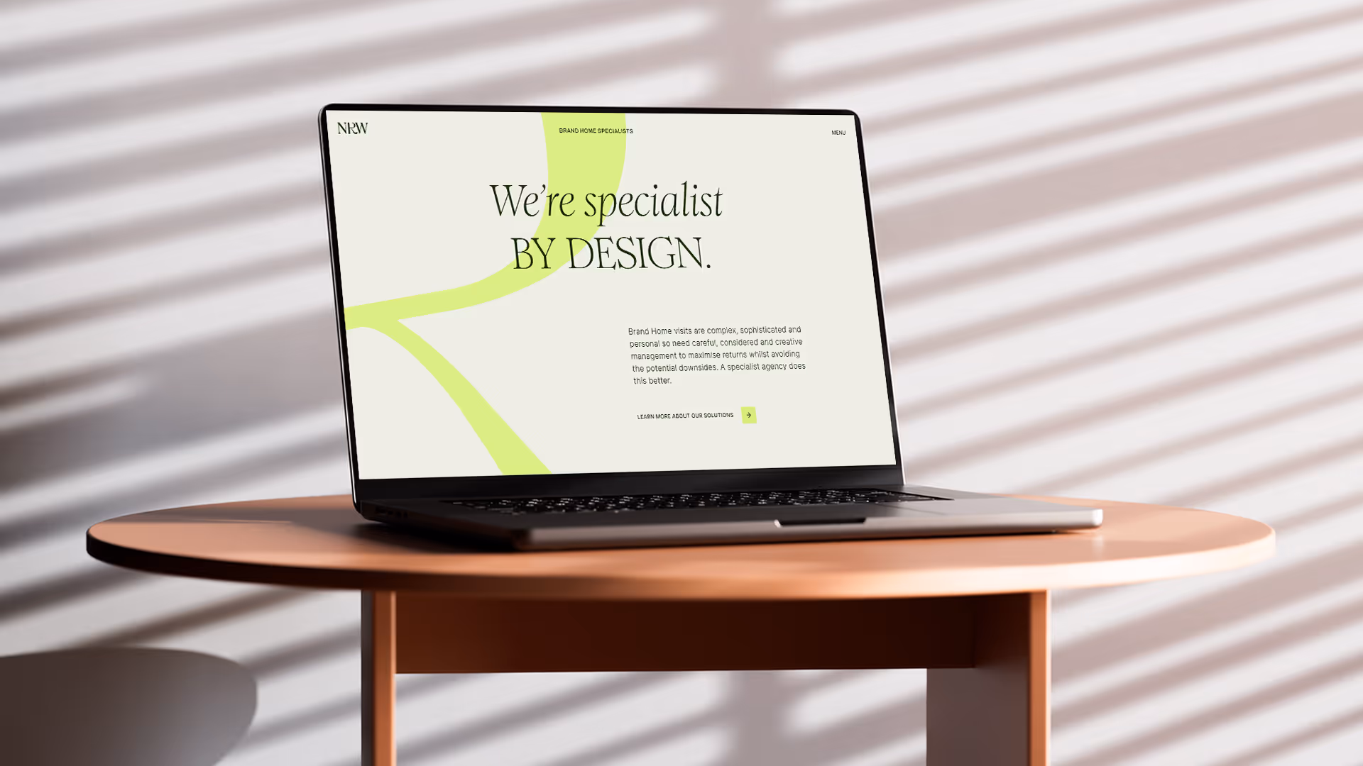
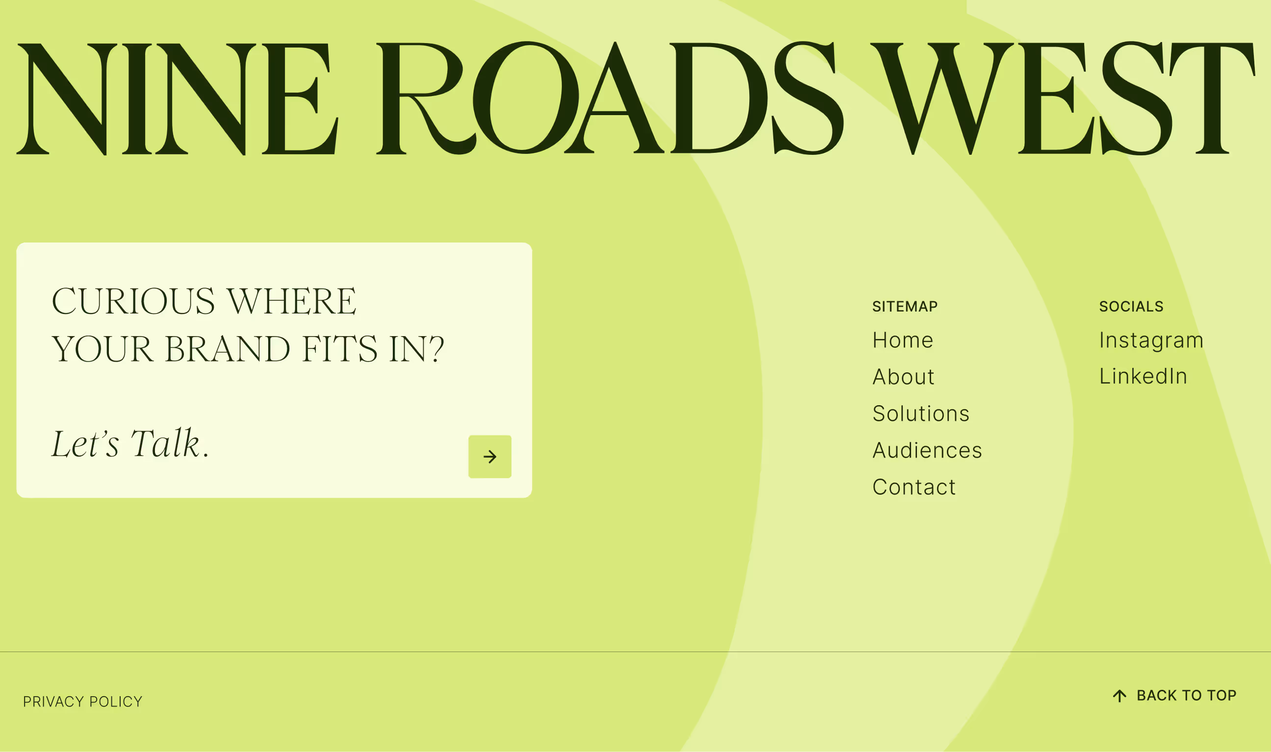
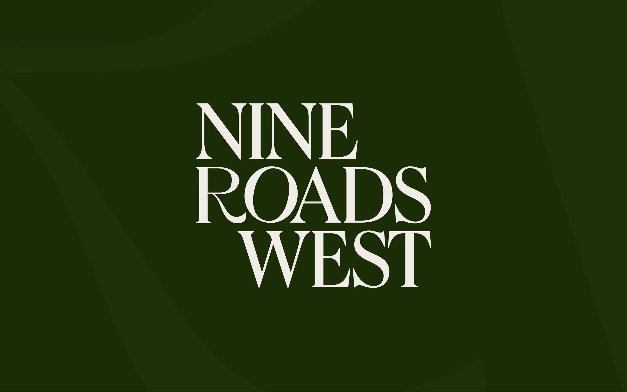
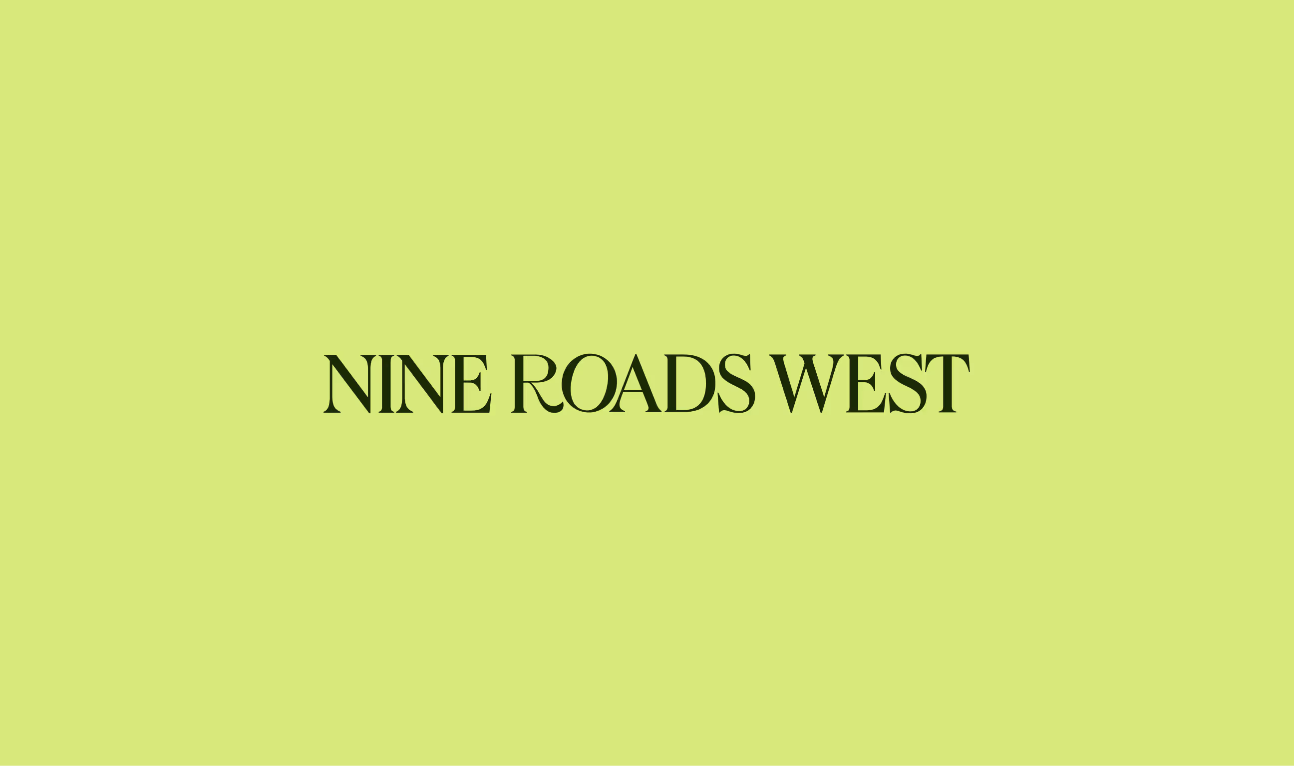
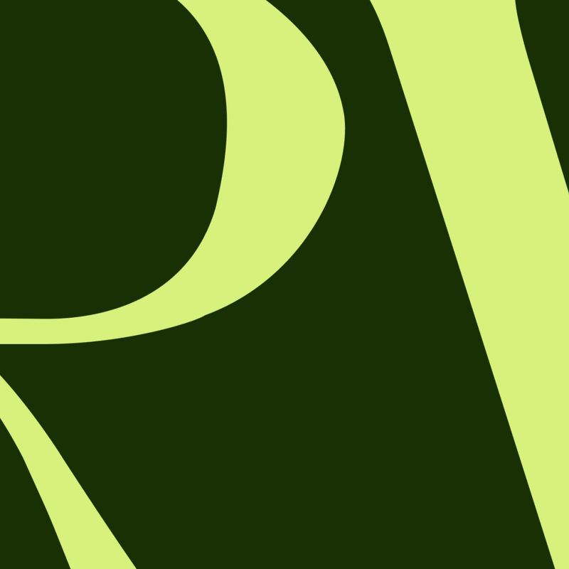
The direction we landed on pairs a customised serif wordmark and headline typeface, giving the brand a bit of rhythm and personality with a minimal palette of deep green and soft grey. To keep things from feeling too restrained, I introduced a neon accent that adds a fresh, energetic edge.
A full identity system - guidelines, social templates, business cards ready from day one. It gave the agency a confident, cohesive presence that matches the premium experience they offer.