Highland Park: A Tribe Apart
Role
Lead designer and art director
Art direction
Graphic design
Campaign
Global toolkit


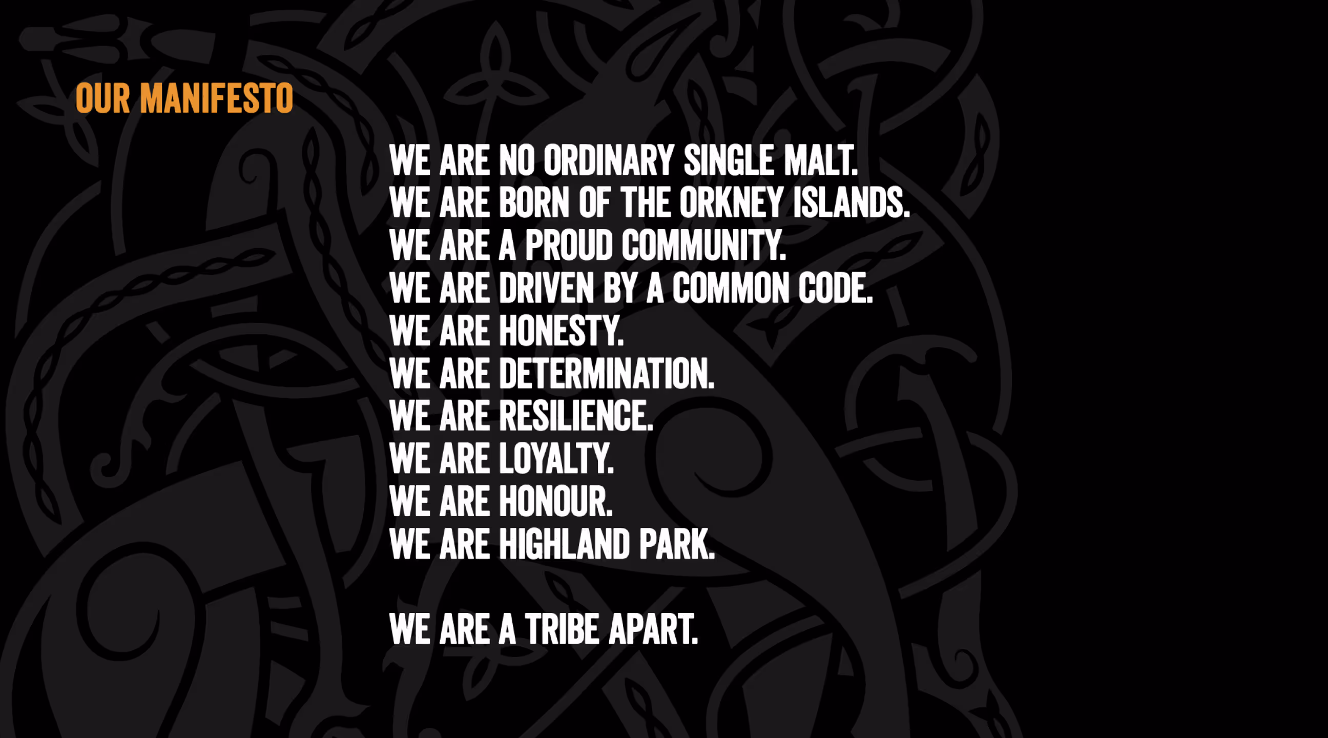
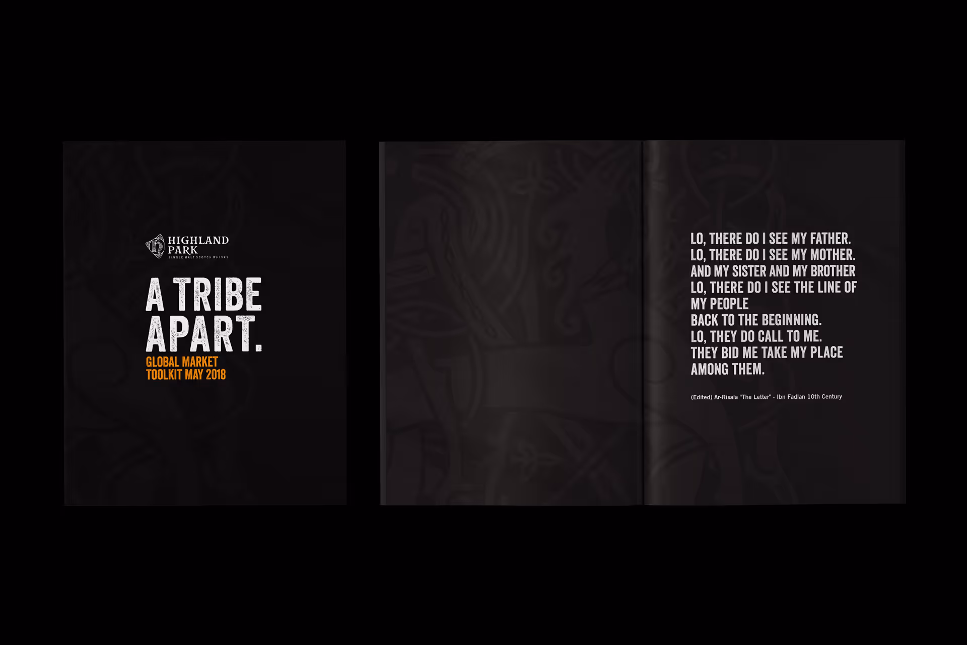
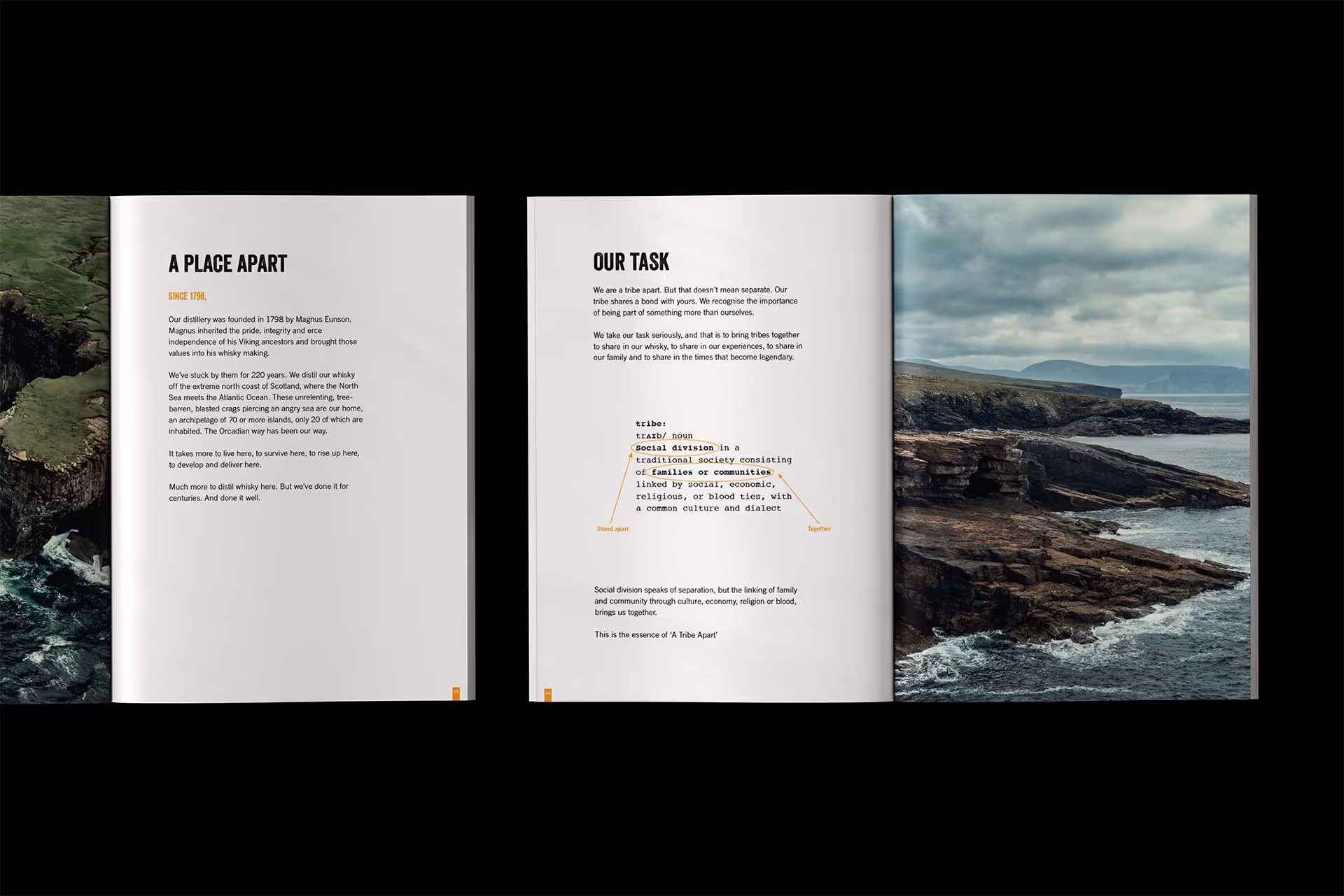
We began by crafting a tribal manifesto, a rallying call that defined the spirit of the Highland Park tribe. This became the campaign’s emotional anchor, setting the tone for all storytelling and design.
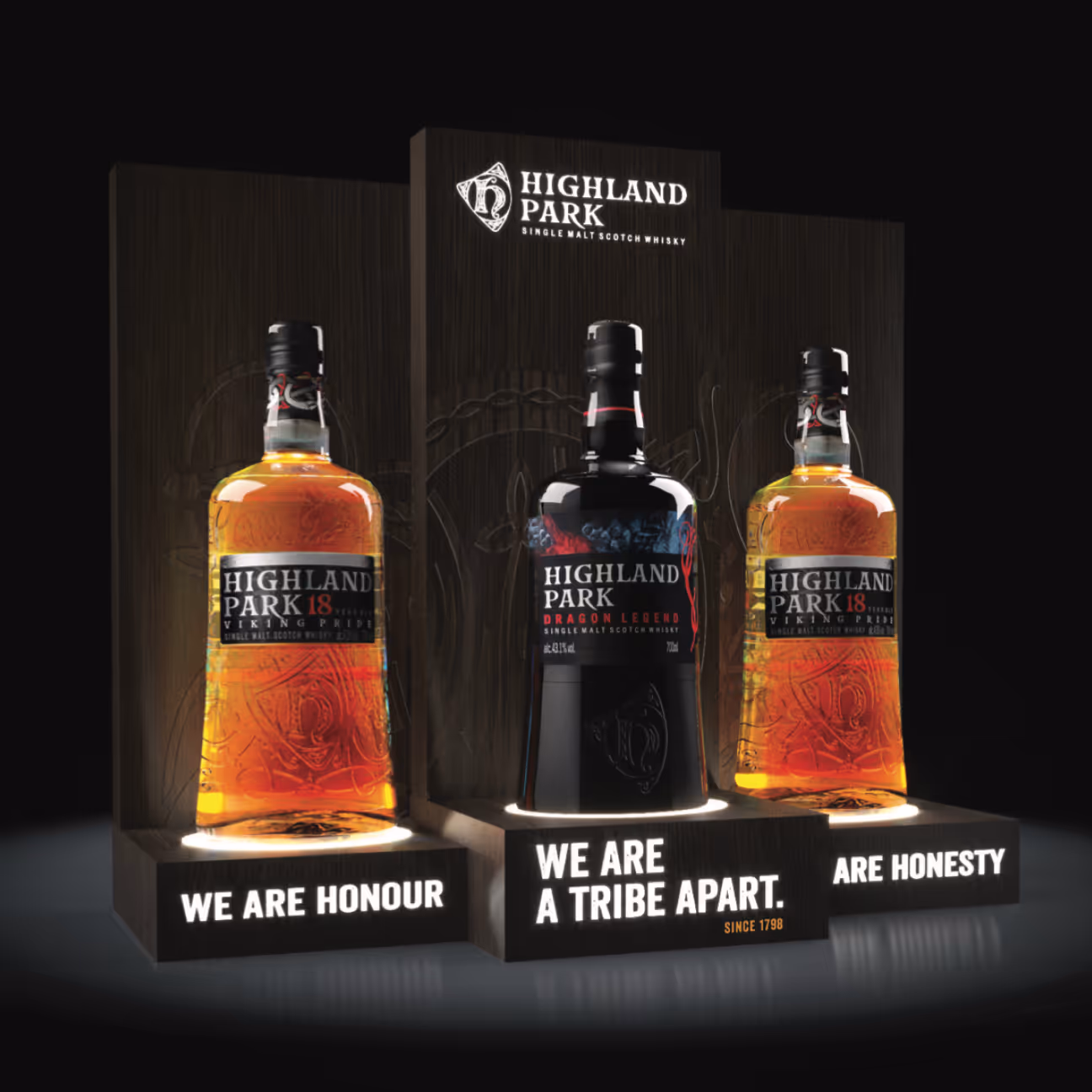
From there, we developed a key visual that combined:
The composition positioned the bottle not just as a product, but as a totem of shared values.
With direction approved, we:
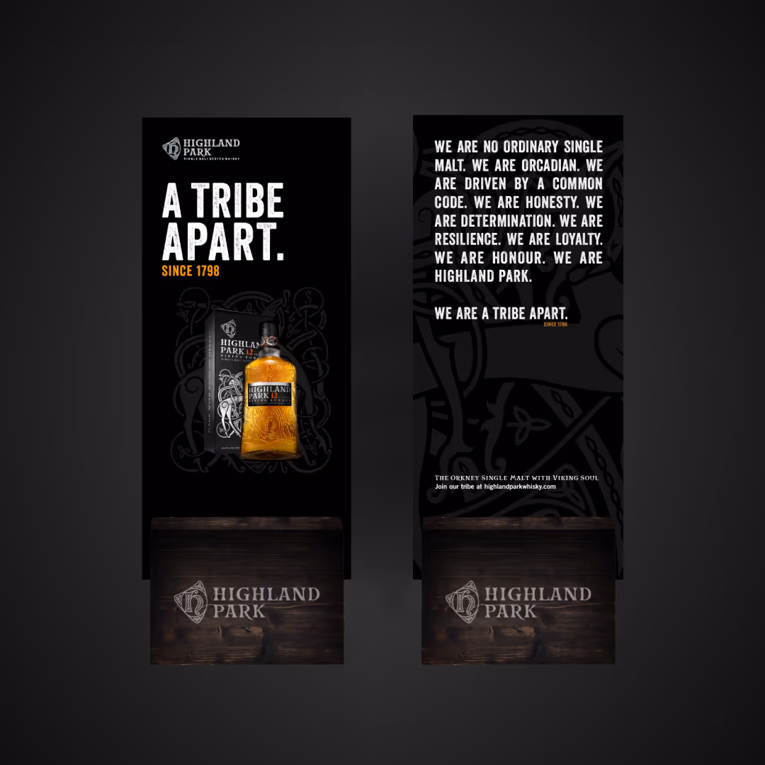
The ‘A Tribe Apart’ campaign gave Highland Park a bold andunified voice, deepening loyalty with existing drinkers while drawing in new audiences. The toolkit, designed as a brand storybook, was adopted worldwide, proving scalable across markets and platforms.
Most importantly, the manifesto became a touchstone for teams and ambassadors, aligning brand voice everywhere it appeared. By focusing on shared values and identity, Highland Park was positioned not just as a whisky, but as a global movement, an international tribe connected by passion, craft, and belonging.