Audley
Role
Lead brand and digital designer
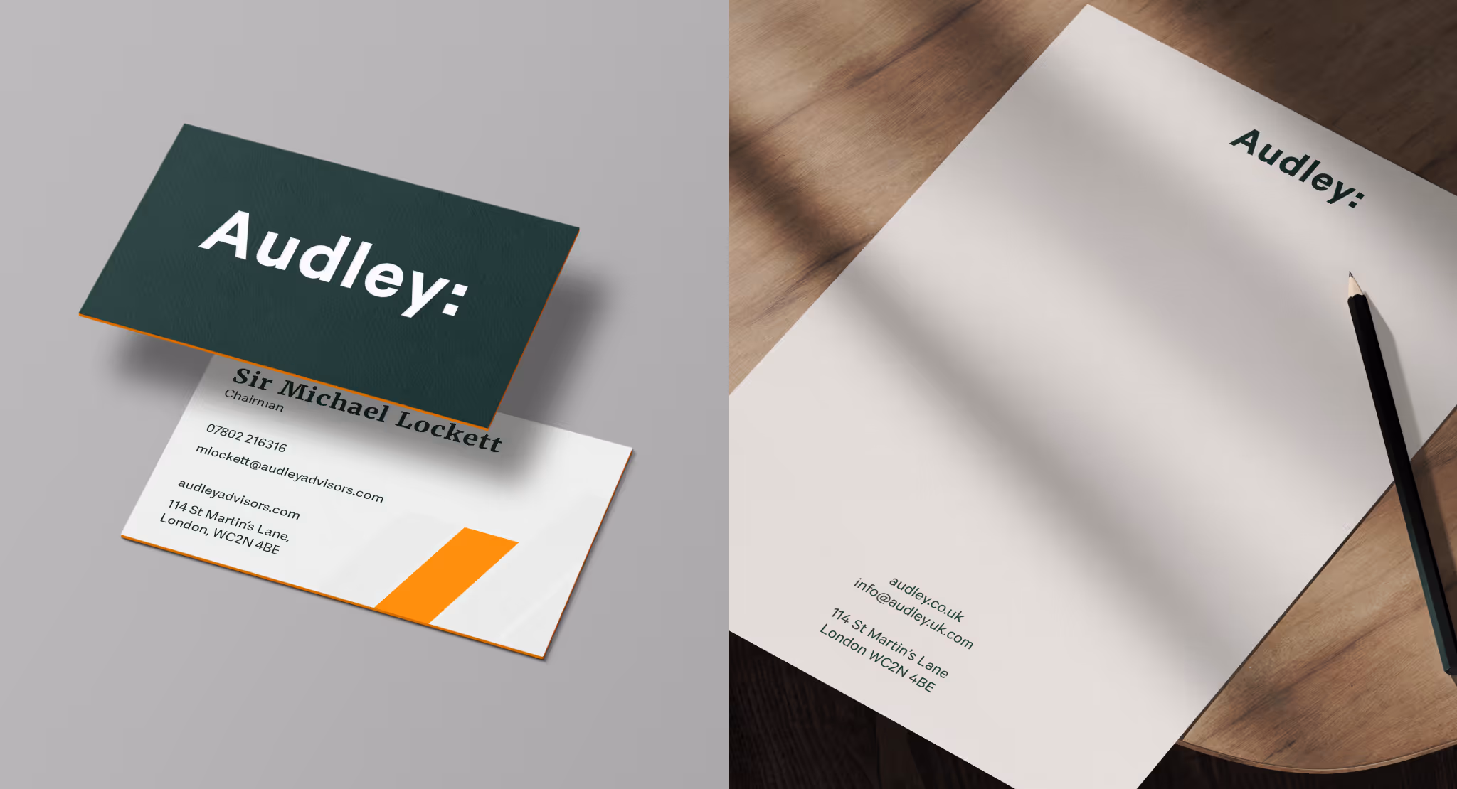
Brand visual identity refresh
Squarespace website design
Brand guidelines
Social marketing assets
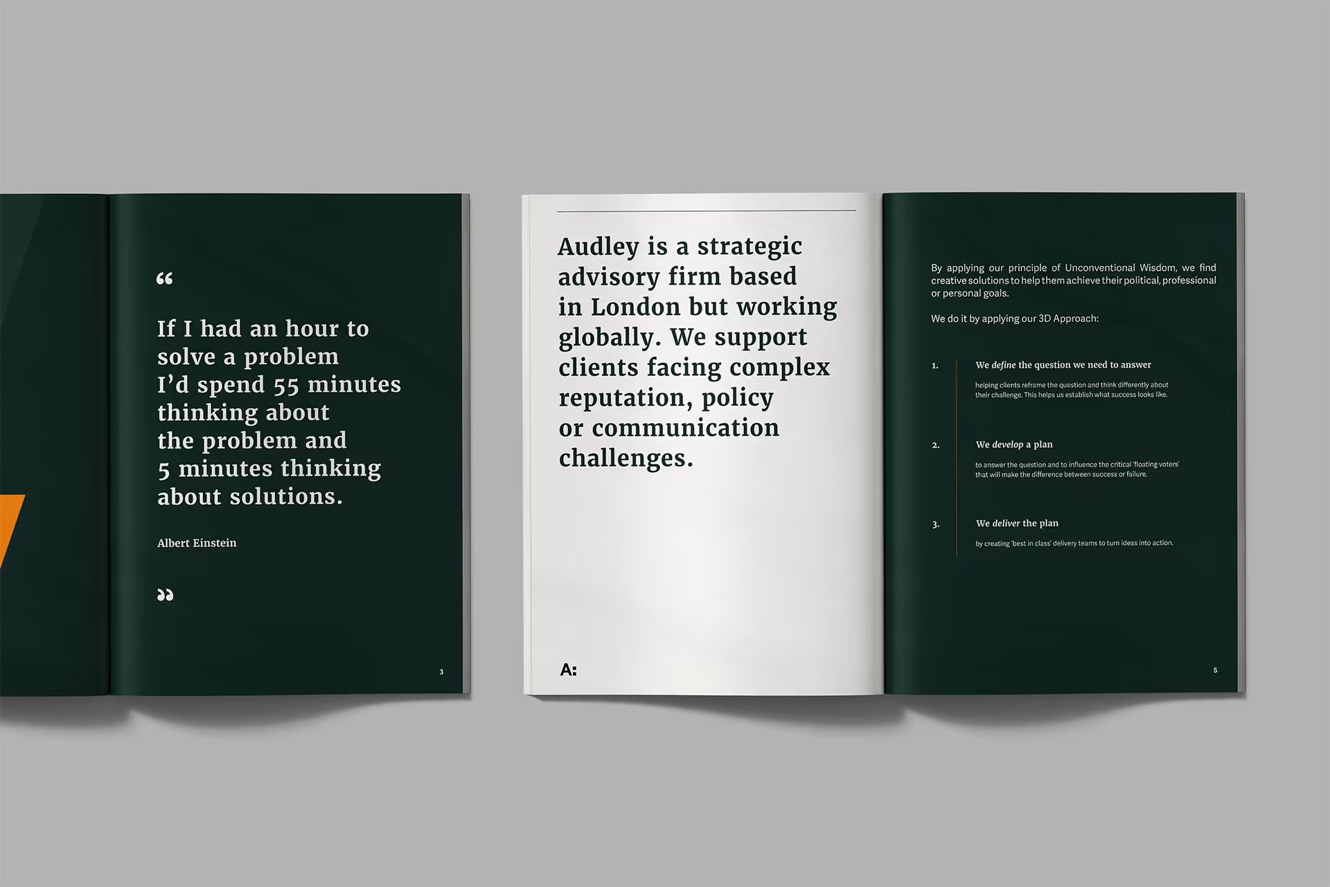
Reports and publications
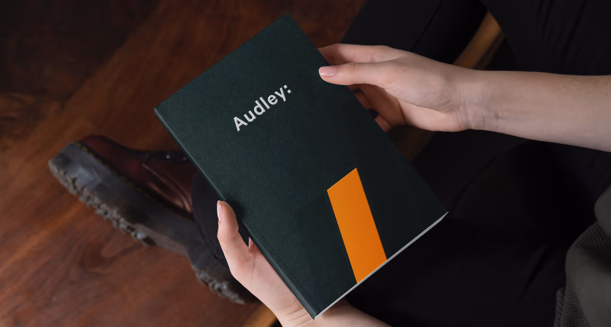
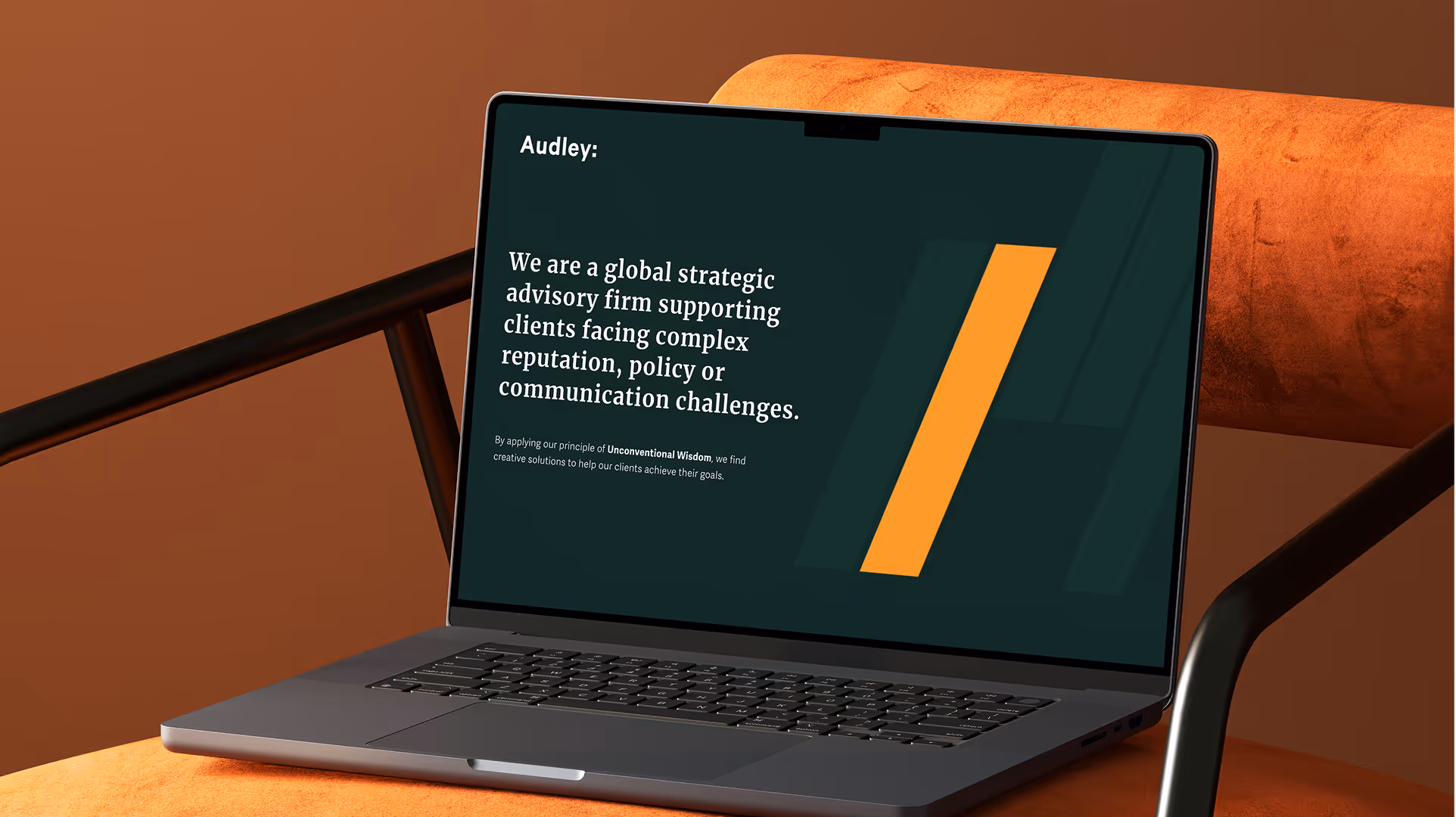
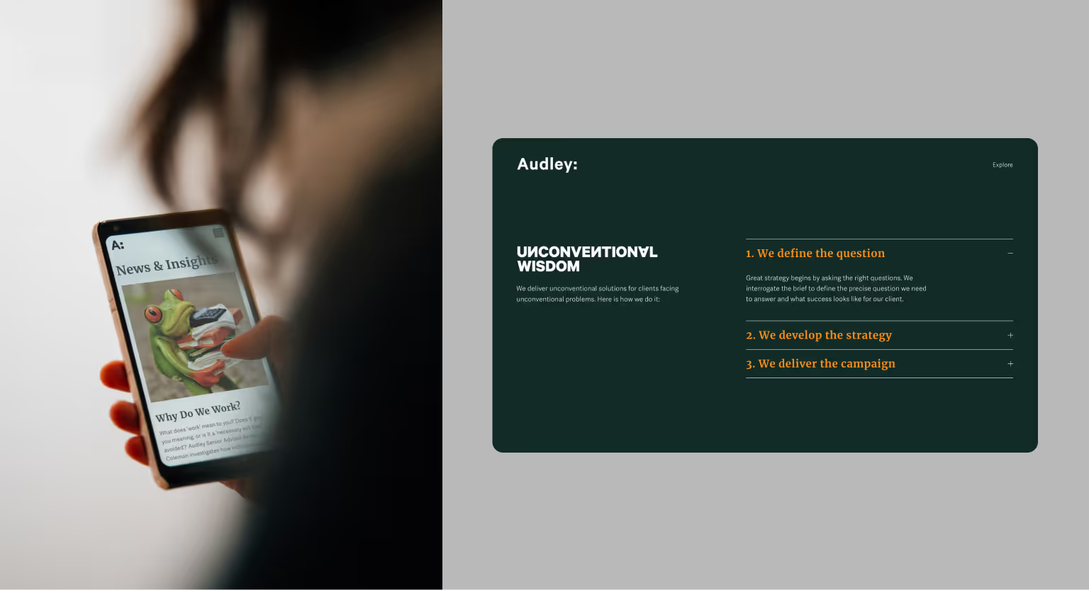
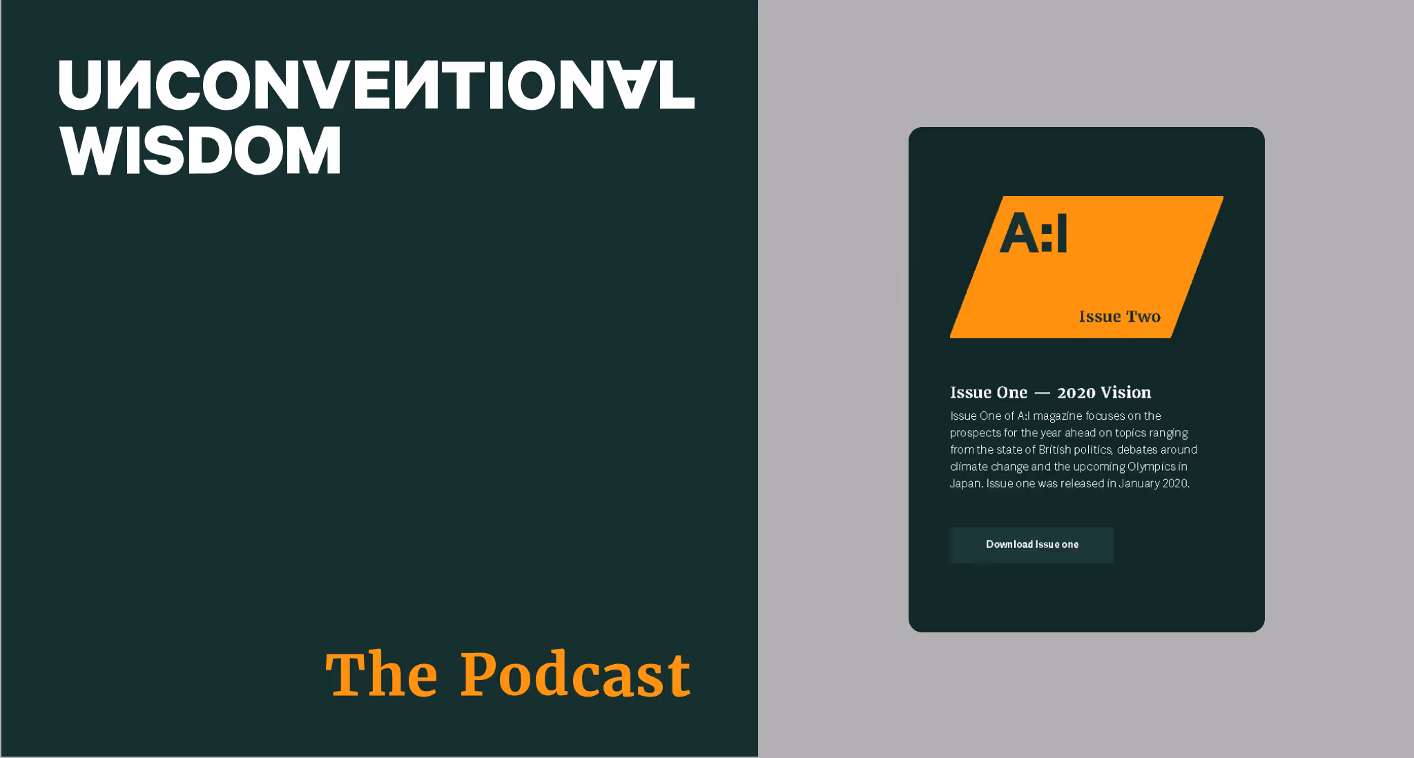
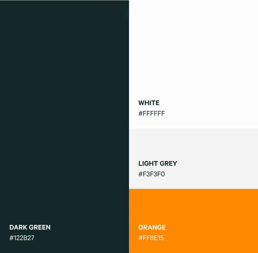
The project kicked off with a full visual identity refresh. I introduced a rich, new colour palette, dark green as a solid, grounding background, paired with vibrant orange accents and dark grey text. This creates a modern, premium look that lets key elements stand out.
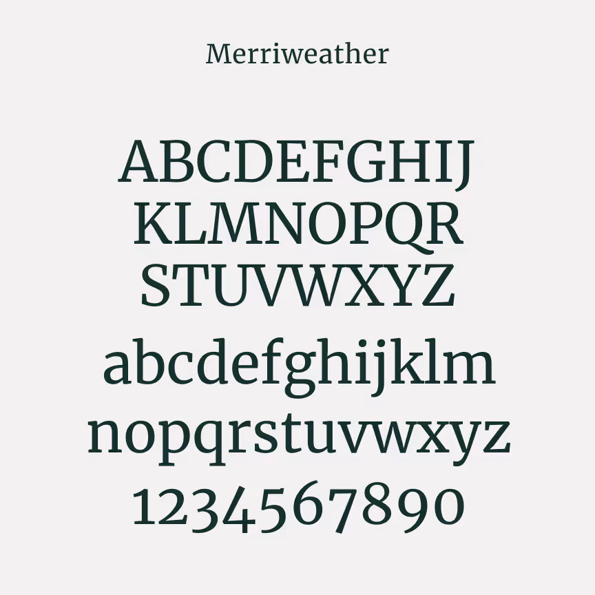
Headlines use a strong serif style inspired by traditional media to convey trust, while a clean sans serif body font keeps everything legible and balanced.
Next up was the website redesign, bringing Audley’s new brand to life online:
A unified brand identity and website that truly reflects Audley’s expertise and originality. All marketing and internal assets now live under a consistent, professional visual system.
The team can now communicate their services clearly and effectively. The cohesive design system has streamlined workflows, made it easier to create adaptable documents and materials and given the team the confidence to actively use and update the site helping drive both engagement and growth.